 akiko shinzato focuses another skin jewelry collection on enhancing one's face
akiko shinzato focuses another skin jewelry collection on enhancing one’s faceall photos by runa anzai, courtesy of akiko shinzato
aug 05, 2015
akiko shinzato focuses another skin jewelry collection on enhancing one's face
akiko shinzato focuses another skin jewelry collection on enhancing one’s faceall photos by runa anzai, courtesy of akiko shinzato
society is obsessed with beauty and the power it is able to project. from simple enhancements like make-up, to the more involved route of cosmetic surgery, we continue to seek ways in which to tweak our appearances and alter how we are perceived by others. with that, someone may not always be as they seem… physically. this is particularly evident through social networking sites which allow users to broadcast themselves in a way that may not always be 100% — whether it’s through edited photographs, or the elaboration of certain points of one’s profile — whereby one can create an ‘identity’.
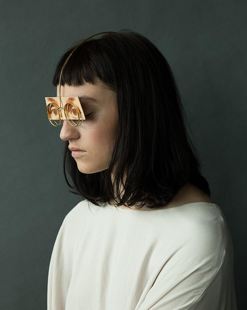
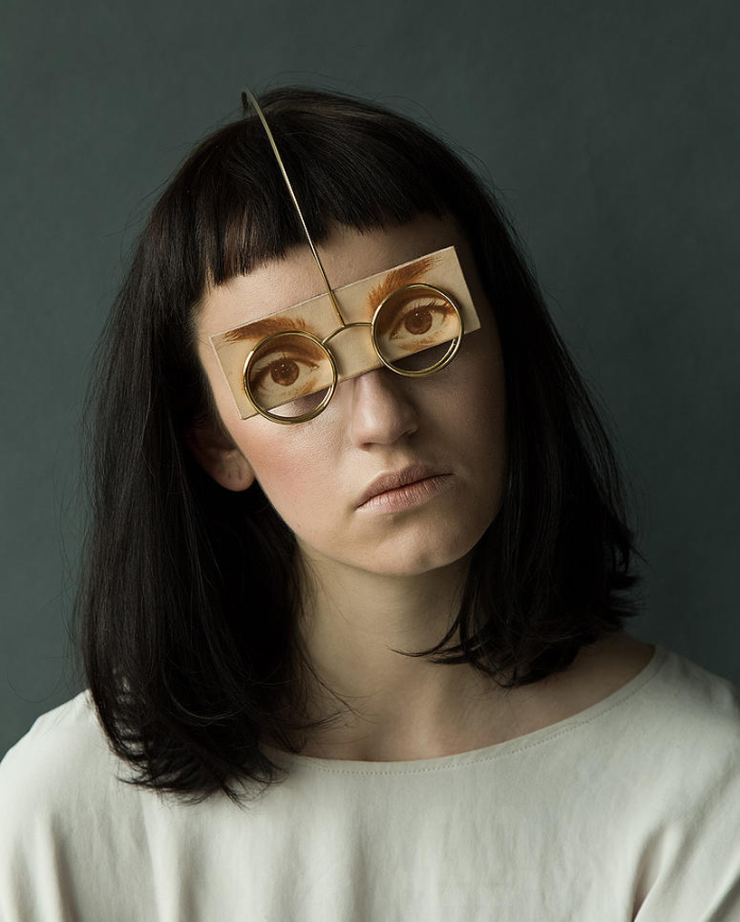
head / eye piece made from gold plated brass, vegetable tanned leather and mirror
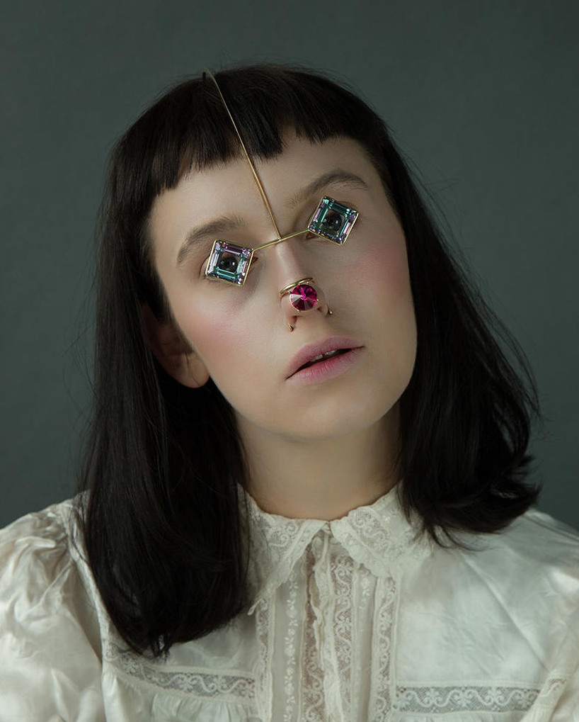
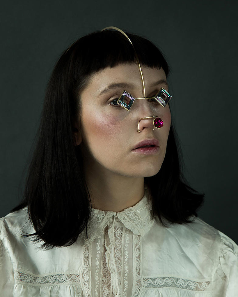
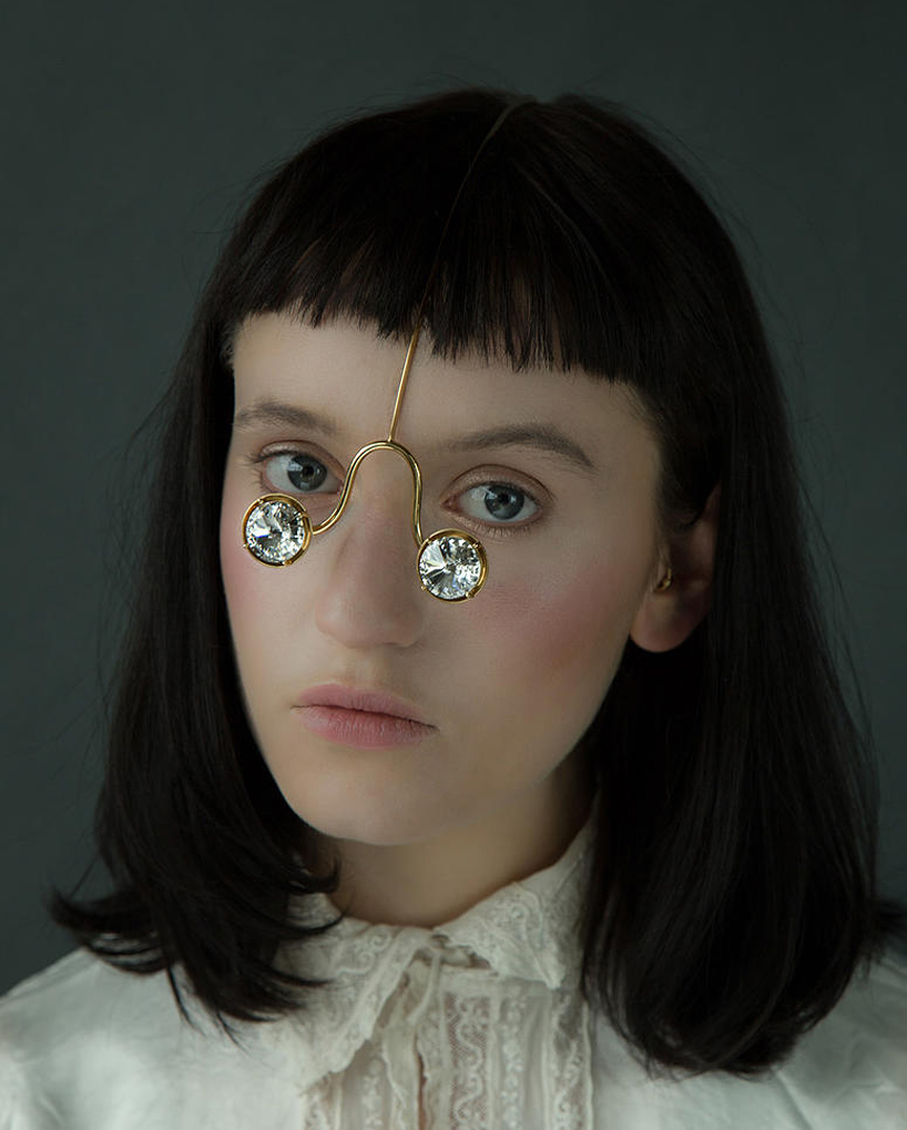
observing these societal behaviors and our pursuit for beauty and physical attractiveness, akiko shinzato has delicately crafted ‘another skin’, influenced by the aesthetic and structural idea of a pair of pince-nez — a style of glasses used throughout the 19th century that simply pinched someone’s nose to stay in place, rather than using the support of arms. the collection of jewelry addresses the part of the body that is focused on during the first impression, and what people seem to care about most: the face. utilizing precious materials such as leather and crystal, in combination with soft metals, the london-based designer explores how easily one can change their appearance.
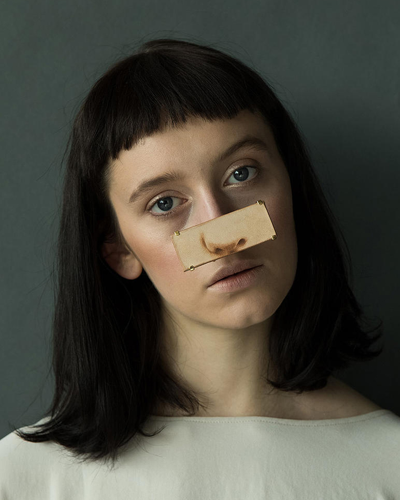
nose piece made from gold plated brass, vegetable tanned leather and mirror
‘another skin’ is composed of two series: ‘wearing make-up’ and ‘putting on someone’s identity’.
‘putting on someone’s identity’ is a set of leather pieces in which the wearer mixes her own facial features with that of others, while reflecting on herself in the mirror at the same time. each element partially hides particular characteristics of the individual, while unveiling a completely different identity.
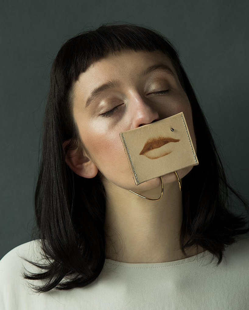
mouth piece made from gold plated brass, vegetable tanned leather, cultured fresh water pearl and mirror
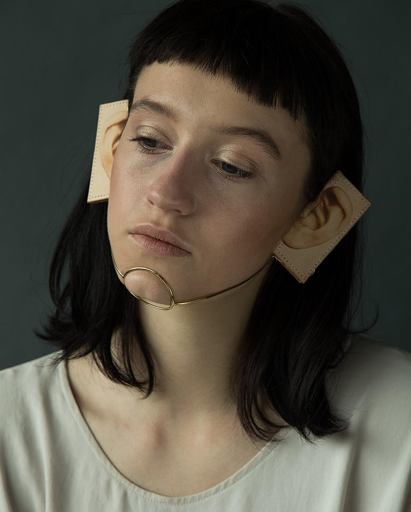
ear piece made from gold plated brass and vegetable tanned leather
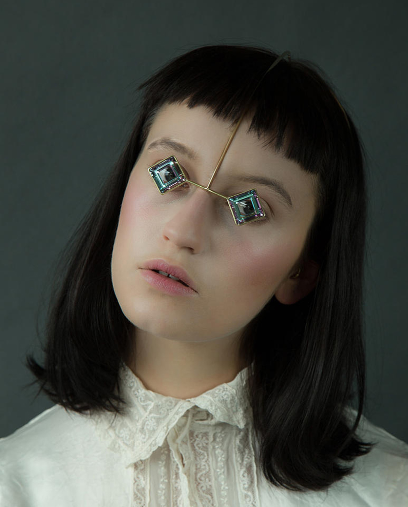
head / eye piece made from gold plated brass and swarovski crystal
‘wearing make-up’ uses precious gems to create jewelry that is formed to adopt the features of a painted clown; fragilely hanging from one’s face. void of any kind of humor or foolishness of a comic entertainer. in a way, it speaks to how color and sheen in make-up are used to highlight certain.
‘another skin’ questions norms of beauty, and to what lengths we would go to improve our appearance.
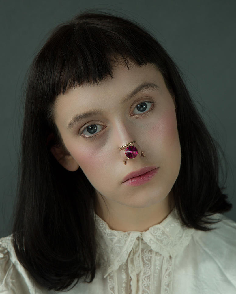
nose piece made from gold plated brass and swarovski crystal
head / eye piece made from gold plated brass and swarovski crystal
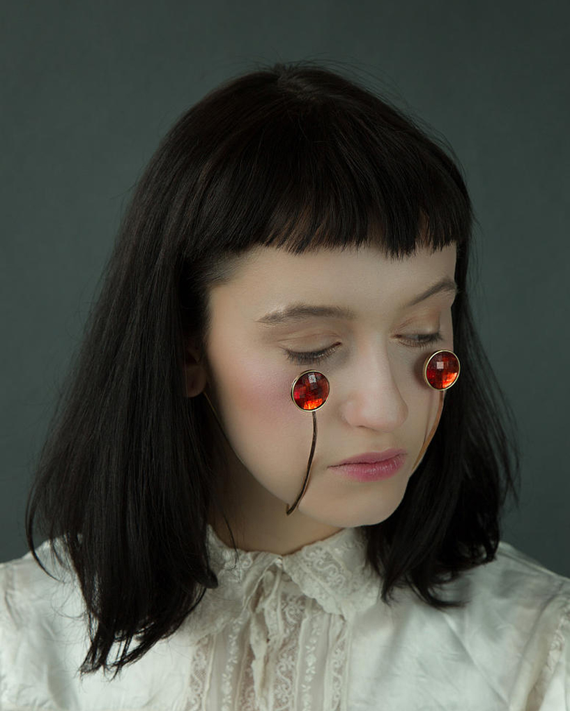
cheek piece made from gold plated brass and swarovski crystal
credits:
model: kitty garrett
hair & makeup: yoko minami
stylist: kei terayama
Source : http://www.designboom.com/design/akiko-shinzato-another-skin-jewelry-collection-08-05-2015/


 and 2
and 2


 Michelangelo’s vertical elements spanning two stories, in a supreme example of balance and counterpoint.


 Note the opposing diagonal emphasis created by the left and right halves in Cezanne’s Large Bathers. For me this is one of the very great compositional masterpieces of the last 200 years. Cezanne is widely known for his pioneering uses of colour modulation in creating pictorial space. However, the tonal structures seen in his vast body of paintings, work equally hard to create form, movement and space. I’ve been fascinated with this painting for many years and its strong directional counterpoint is something I’ve attempted to examine with the Contrapunctus pieces. See Comp 1,2 and 3.