
Friday, August 31, 2012
I miss someone
เรื่องสำคัญของคุณในสัปดาห์นี้ Eight of Pentacles ช่วงเวลาของการขยับขยายธุรกิจ การทำมาหาเงิน การพัฒนาทักษะ การเรียนรู้ ได้คนเข้ามาช่วยเหลืองาน เด่นพิเศษสำหรับคนที่ทำธุรกิจส่วนตัว ตลอดจนงานด้านการศึกษาต่าง ๆ หรืองานในภาคเกษตร
ความรัก ความสัมพันธ์ Six of Pentacles ได้ช่วยเหลือเกื้อกูลกัน ถ้าตัวคุณเดือดร้อนจะได้คนที่ยื่นมือเข้ามาช่วยเหลือ ขณะเดียวกันก็อาจต้องช่วยเหลือคนอื่นด้วย ทิศทางความสัมพันธ์จะให้ความอบอุ่นมั่นใจกับคุณมากขึ้นเรื่อย ๆ จะไม่โดดเดี่ยว
สถานการณ์การเงิน The Devil ระวังแรงชักจูงใจที่ "แรง" มาก โอกาสจะจับจ่ายใช้สอยมีอย่างมากมาย ทั้งสิ่งที่ "อยากได้" จนไม่อยากจะคิดมากอีกต่อไป (พร้อมจ่าย) ที่ระวังคือถ้าเกินกำลังจะเป็นหนี้ผูกพันในระยะยาว
ธุรกิจ การงาน Eight of Wands งานคุณกำลังชุกได้ที่ จะมีสิ่งที่งอกเพิ่มจากเดิมด้วย หากเป็นธุรกิจส่วนตัวถือว่าเป็นข่าวดี แต่ถ้าเป็นลูกจ้าง พนักงาน ยังไงก็เหนื่อย แต่ก็ไม่เหนื่อยเปล่าหรอกน่า จะได้รับค่าตอบแทนที่สมเหตุสมผล
คำเตือนหรือปัญหาที่อาจเกิดขึ้น Queen of Pentacles การเงินค่ะ การจัดการของตัวคุณเอง กรณีเป็นหญิง แต่ถ้าคุณเป็นชาย อาจมีผู้หญิงสักคนหนึ่งกำลังกดดันคุณอยู่ในเรื่องนี้ หรือเป็นปัญหา
คำแนะนำพิเศษ The Magician จะเป็นช่วงของแรงบันดาลใจ ความคิดที่เฉียบคม ได้อะไรดี ๆ เข้ามาโดยไม่คาดฝัน ดั่งการสามารถทำกำไรจากขยะ (สิ่งที่คนอื่นไม่เห็นค่า) จะได้รับการยกย่อง ปัญหาที่เรื้อรังจะเริ่มได้รับการเยียวยา
เรื่องสำคัญของคุณในสัปดาห์นี้ The Hierophant การเกี่ยวพันกับบุคคลหรือสถานการณ์ที่คอนเซอร์เวทีฟพอสมควร จะได้ทั้งประโยชน์ แง่คิด และสิ่งที่น่าเบื่อหน่าย จำเป็นต้องใช้วุฒิภาวะมากในช่วงนี้
ความรัก ความสัมพันธ์ Six of Cups มีโอกาสคืนดี หวนกลับไปทบทวนความสัมพันธ์ หรือมีความรู้สึกดี ๆ เกิดขึ้นกับคนเดิม ได้พบคนรักเก่า ได้ระลึกบางเรื่องราวในความทรงจำ หากอยู่ไกลกันจะคิดถึงกันเป็นพิเศษ
สถานการณ์การเงิน Nine of Pentacles เด่นอยู่แล้วค่ะ ถือว่าอยู่ในเกณฑ์มั่นคง มีทรัพย์สินไม่เดือดร้อน เผลอ ๆ ยังต้องดูแลช่วยเหลือคนอื่นด้วย แต่บางทีเงินไม่สามารถซื้อความสุขให้คุณเพียงพอนี่สิ
ธุรกิจ การงาน Ten of Cups จะได้ทำงานในบรรยากาศที่ดี ร่วมกับมิตร มีความเป็นครอบครัวหรือความใกล้ชิดสนิทสนม แม้จะมีเรื่องห่วย ๆ แต่ความสัมพันธ์กับผู้คนจะดีเป็นพิเศษ
คำเตือนหรือปัญหาที่อาจเกิดขึ้น The Hermit ความเงียบเหงาเปล่าเปลี่ยว ความแปลกแยกที่ไม่อาจจะแก้ไขได้ นอนไม่หลับ หรือมีความกังวลอย่างลึกซึ้งในจิตใจ
คำแนะนำพิเศษ Temperance จำเป็นต้องปรับตัวไปกับสิ่งที่เกิดขึ้น ทั้งดีและร้าย ต้องประนีประนอมในระหว่างนี้ ถึงจะฝืนความรู้สึกแค่ไหน แต่ก็จะทำให้คุณค่อย ๆ ถอนเท้าจากโคลนหนืด ๆ เดินไปข้างหน้าได้ทีละก้าว ดีกว่าจมปลักอยู่กับที่เดิม
My Love September 2012
 |  |  | ||
อดีต
|
ปัจจุบัน
|
อนาคต
|
คำทำนาย
| ||
| ||
|
My September 2012
| |||||||||||||||||||||||||||||||||||||||||||||||||
| |||||||||||||||||||||||||||||||||||||||||||||||||
| |||||||||||||||||||||||||||||||||||||||||||||||||


Wednesday, August 29, 2012


Sunday, August 26, 2012
Wednesday, August 22, 2012

Sunday, August 19, 2012


Friday, August 17, 2012
The Psychology of Color and Emotion
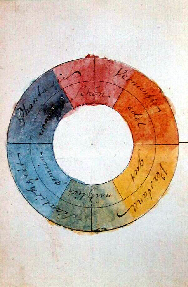
Goethe on the Psychology of Color and Emotion
by Maria Popova
“Colour itself is a degree of darkness.”
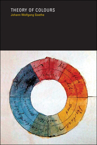 Color is an essential part of how we experience the world, both biologically and culturally. One of the earliest formal explorations of color theory came from an unlikely source — the German poet, artist, and politician Johann Wolfgang von Goethe, who in 1810 publishedTheory of Colours (public library; public domain), his treatise on the nature, function, and psychology of colors. Though the work was dismissed by a large portion of the scientific community, it remained of intense interest to a cohort of prominent philosophers and physicists, including Arthur Schopenhauer,Kurt Gödel, and Ludwig Wittgenstein.
One of Goethe’s most radical points was a refutation of Newton’s ideas about the color spectrum, suggesting instead that darkness is an active ingredient rather than the mere passive absence of light.
…light and darkness, brightness and obscurity, or if a more general expression is preferred, light and its absence, are necessary to the production of colour…. Colour itself is a degree of darkness.
But perhaps his most fascinating theories explore the psychological impact of different colors on mood and emotion — ideas derived by the poet’s intuition, which are part entertaining accounts bordering on superstition, part prescient insights corroborated by hard science some two centuries later, and part purely delightful manifestations of the beauty of language.
YELLOWThis is the colour nearest the light. It appears on the slightest mitigation of light, whether by semi-transparent mediums or faint reflection from white surfaces. In prismatic experiments it extends itself alone and widely in the light space, and while the two poles remain separated from each other, before it mixes with blue to produce green it is to be seen in its utmost purity and beauty. How the chemical yellow develops itself in and upon the white, has been circumstantially described in its proper place.In its highest purity it always carries with it the nature of brightness, and has a serene, gay, softly exciting character.State is agreeable and gladdening, and in its utmost power is serene and noble, it is, on the other hand, extremely liable to contamination, and produces a very disagreeable effect if it is sullied, or in some degree tends to the minus side. Thus, the colour of sulphur, which inclines to green, has a something unpleasant in it.When a yellow colour is communicated to dull and coarse surfaces, such as common cloth, felt, or the like, on which it does not appear with full energy, the disagreeable effect alluded to is apparent. By a slight and scarcely perceptible change, the beautiful impression of fire and gold is transformed into one not undeserving the epithet foul; and the colour of honour and joy reversed to that of ignominy and aversion. To this impression the yellow hats of bankrupts and the yellow circles on the mantles of Jews, may have owed their origin.RED-YELLOWAs no colour can be considered as stationary, so we can very easily augment yellow into reddish by condensing or darkening it. The colour increases in energy, and appears in red-yellow more powerful and splendid.All that we have said of yellow is applicable here, in a higher degree. The red-yellow gives an impression of warmth and gladness, since it represents the hue of the intenser glow of fire.YELLOW-REDAs pure yellow passes very easily to red-yellow, so the deepening of this last to yellow-red is not to be arrested. The agreeable, cheerful sensation which red-yellow excites increases to an intolerably powerful impression in bright yellow-red.The active side is here in its highest energy, and it is not to be wondered at that impetuous, robust, uneducated men, should be especially pleased with this colour. Among savage nations the inclination for it has been universally remarkedy and when children, left to themselves, begin to use tints, they never spare vermilion and minium.In looking steadfastly at a perfectly yellow-red surface, the colour seems actually to penetrate the organ. It produces an extreme excitement, and still acts thus when somewhat darkened. A yellow-red cloth disturbs and enrages animals. I have known men of education to whom its effect was intolerable if they chanced to see a person dressed in a scarlet cloak on a grey, cloudy day.The colours on the minus side are blue, red-blue, and blue-red. They produce a restless, susceptible, anxious impression.BLUEAs yellow is always accompanied with light, so it may be said that blue still brings a principle of darkness with it.This colour has a peculiar and almost indescribable effect on the eye. As a hue it is powerful — but it is on the negative side, and in its highest purity is, as it were, a stimulating negation. Its appearance, then, is a kind of contradiction between excitement and repose.As the upper sky and distant mountains appear blue, so a blue surface seems to retire from us.But as we readily follow an agreeable object that flies from us, so we love to contemplate blue — not because it advances to us, but because it draws us after it.Blue gives us an impression of cold, and thus, again, reminds us of shade. We have before spoken of its affinity with black.Rooms which are hung with pure blue, appear in some degree larger, but at the same time empty and cold.The appearance of objects seen through a blue glass is gloomy and melancholy.When blue partakes in some degree of the pltis side, the effect is not disagreeable. Sea-green is rather a pleasing colour.RED-BLUEWe found yellow very soon tending to the intense state, and we observe the same progression in blue.Blue deepens very mildly into red, and thus acquires a somewhat active character, although it is on the passive side. Its exciting power is, however, of a different kind from that of the red-yellow. It may be said to disturb, rather than enliven.As augmentation itself is not to be arrested, so we feel an inclination to follow the progress of the colour, not, however, as in the case of the red-yellow, to see it still increase in the active sense, but to find a point to rest in.In a very attenuated state, this colour is known to us under the name of lilac; but even in this degree it has a something lively without gladness.BLUE-REDThis unquiet feeling increases as the hue progresses, and it may be safely assumed, that a carpet of a perfectly pure deep blue-red would be intolerable. On this account, when it is used for dress, ribbons, or other ornaments, it is employed in a very attenuated and light state, and thus displays its character as above defined, in a peculiarly attractive manner.As the higher dignitaries of the church have appropriated this unquiet colour to themselves, we may venture to say that it unceasingly aspires to the cardinal’s red through the restless degrees of a still impatient progression.REDWhoever is acquainted with the prismatic origin of red will not think it paradoxical if we assert that this colour partlyactu, partly potentia, includes all the other colours.We have remarked a constant progress or augmentation in yellow and blue, and seen what impressions were produced by the various states; hence it may naturally be inferred that now, in the junction of the deepened extremes a feeling of satisfaction must succeed ; and thus, in physical phenomena, this highest of all appearances of colour arises from the junction of two contrasted extremes which have gradually prepared themselves for a union.As a pigment, on the other hand, it presents itself to us already formed, and is most perfect as a hue in cochineal ; a substance which, however, by chemical action may be made to tend to the plus or the minus side, and may be considered to have attained the central point in the best carmine.The effect of this colour is as peculiar as its nature. It conveys an impression of gravity and dignity, and at the same time of grace and attractiveness. The first in its dark deep state, the latter in its light attenuated tint; and thus the dignity of age and the amiableness of youth may adorn itself with degrees of the same hue.History relates many instances of the jealousy of sovereigns with regard to the quality of red. Surrounding accompaniments of this colour have always a grave and magnificent effect. The red glass exhibits a bright landscape in so dreadful a hue as to inspire sentiments of awe.GREENIf yellow and blue, which we consider as the most fundamental and simple colours, are united as they first appear, in the first state of their action, the colour which we call green is the result.The eye experiences a distinctly grateful impression from this colour. If the two elementary colours are mixed in perfect equality so that neither predominates, the eye and the mind repose on the result of this junction as upon a simple colour. The beholder has neither the wish nor the power to imagine a state beyond it. Hence for rooms to live in constantly, the green colour is most generally selected.
Though hardly a work of science, Theory of Colours stands as an absorbing account of the philosophy and artistic experience of color, bridging the intuitive and the visceral in a way that, more than two hundred years later, continues to intrigue.
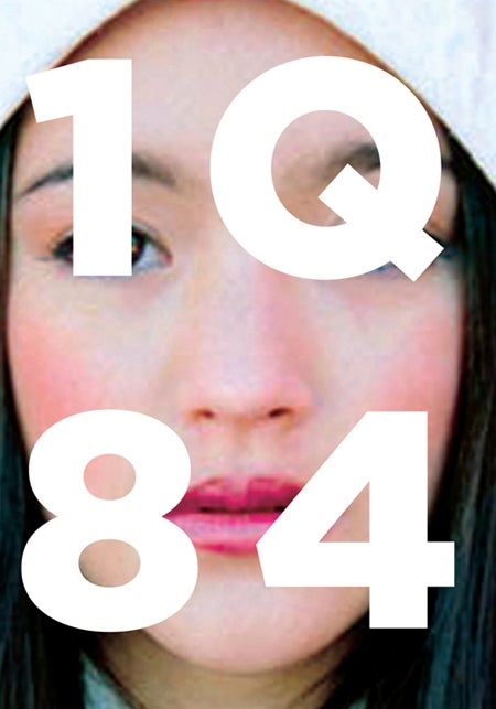
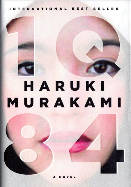
แนวคิดในการออกแบบปก
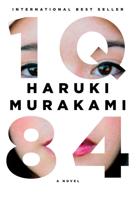
แนวคิดในการออกแบบปก 1Q84 ฉบับภาษาอังกฤษ วางแผงตุลาคม 2554 พร้อมๆ กับเล่มภาษาไทย
เหลือเวลาอีกไม่กี่เดือนก็จะถึงเดือนตุลาคม กำหนดวางแผง 1Q84 เล่มภาษาไทยที่ชาวพลพรรคสำนักพิมพ์กำมะหยี่และเพื่อนร่วมงานกำลังตั้งอกตั้งใจทำงานกันอยู่
แต่หนังสือ นอกจากเนื้อในแล้ว ยังมีปกให้เราต้องดูแล เมื่อเวลากระชั้นเข้ามาอย่างไม่รอรีเช่นนี้ เราก็คิดว่าถึงเวลาเริ่มคิดถึงการออกแบบปกกันบ้างแล้ว วันนี้เลยเสิร์ชหาในกุ๊กเกิลดูว่าปกเวอร์ชั่นอื่นๆ เขาเป็นอย่างไร ได้เห็นแนวคิดหลายอย่างผ่านผลงานปกจากหลายๆ ประเทศ แต่ไม่มีปกจากประเทศไหน "คิดเยอะ" ดี เท่าปกจากเวอร์ชั่นภาษาอังกฤษ ที่มีกำหนดวางแผงเดือนตุลาคมนี้ (เดือนเดียวกับเวอร์ชั่นภาษาไทย)
คุณ Chip Kidd ผู้ออกแบบปกเล่มนี้ ได้กล่าวอธิบายแนวความคิดในการออกแบบปกไว้ >>ที่นี่
ส่วนข้างล่างนี้เป็นบทแปลบทความดังกล่าวเป็นภาษาไทยค่ะ
หลังจากได้รับเกียรติออกแบบปกหนังสือฉบับปกแข็งทุกเล่มของฮารูกิ มูราคามิ ตั้งแต่เล่ม ดิ เอเลเฟน วานิชส์ ผมก็ตั้งตารอที่จะได้ทำงานเล่ม 1Q84 เป็นพิเศษ เพราะเป็นหนังสือที่ผู้เขียนมุ่งมั่นเขียนและผูกพันอย่างที่สุด (และเป็นเรื่องที่ไม่ธรรมดาเลย) อีกอย่างหนึ่งก็คือ ในทางตรรกสัญลักษณ์ ชื่อหนังสือเป็นความฝันของนักออกแบบ ด้วยลักษณะอันเป็นเอกลักษณ์ของทั้งสี่ตัวสามารถนำมาออกแบบเป็นงานที่ทรงพลังและโดดเด่นได้ง่ายๆ
เรื่องราวในหนังสือ เล่าเรื่องสองเรื่องที่ดูผิวเผินคล้ายจะไม่มีความเกี่ยวข้องกัน ที่ค่อยๆ ขมวดพันเข้าหากันทีละน้อย เรื่องแรกเกี่ยวกับผู้หญิงคนหนึ่งที่ชื่ออาโอมาเมะ ที่เปิดเรื่องมา เจอว่าตัวเองต้องปีนบันไดฉุกเฉินของทางด่วนที่รถติดหนักในกรุงโตเกียวเพื่อหลีกเลี่ยงรถติด เมื่อเธอลงมาถึงพื้นดิน ในภายหลังเธอก็เกิดความเชื่อว่าเธอเข้าสู่ความจริงอีกอย่างหนึ่งผ่านทางนั้น เป็นความจริงที่แตกต่างจากความจริงที่เธอรู้จักเล็กน้อย เธอให้ชื่อมิติใหม่นี้ในใจว่า 1Q84 (เรื่องราวในหนังสือเกิดขึ้นในปี 1984 และในภาษาญี่ปุ่น Q ออกเสียงเหมือน 9) โดยให้ Q มาจาก Question Mark โลกที่แบกรับคำถามอยู่ และแนวความคิดนี้กลายเป็นเรื่องหลักเรื่องหนึ่งในหนังสือชุดนี้
หลังจากได้อ่านต้นฉบับแล้ว ผมก็เกิดความคิดในทันทีว่าการอยู่อย่างคู่ขนานของสถานการณ์ที่อาโอมาเมะเผชิญอยู่ สามารถนำเสนอผ่านการเชื่อมต่อกันของปกหุ้มหนังสือและตัวปก ด้วยการใช้กระดาษหนังแบบโปร่งแสงในการทำปกหุ้ม บนปกหุ้มนี้มีชื่อหนังสืออยู่ชั้นแรก พิมพ์ภาพผู้หญิงให้โผล่ตามช่องของตัวอักษรและตัวเลข ส่วนอื่นๆ ของเธอนอกเหนือจากนั้นไม่ต้องมี
เมื่อปกหุ้มได้หุ้มปก มันจะ "เติมเต็ม" ภาพใบหน้าของเธอ แต่ก็มีบางอย่างที่ประหลาดกำลังเกิดขึ้น และก่อนที่คนอ่านจะได้อ่าน พวกเขาจะถูกบังคับให้คิดถึงเรื่องที่มีคนบางคนเดินทางจากโลกหนึ่งไปอีกโลกหนึ่ง
ยิ่งกว่านั้น สิ่งที่ต้องนำมาพิจารณาเสมอ นั่นคือ มันดูสวยดีทีเดียว
ปกหุ้ม ตรงขาวๆ เป็นกระดาษโปร่งแสง
ปกหนังสือ
ภาพเมื่อปกหุ้มได้หุ้มปกแล้ว

Subscribe to:
Posts (Atom)