Wednesday, June 18, 2014
THE DESIGN AGENDA BY BROGUEN AVERILL
TRIBUTE |
THE DESIGN AGENDA BY BROGUEN AVERILL
NOVEMBER 21, 2013
FOR THIS PROJECT, BROGUEN AVERILL WAS CONVENED WITH ANOTHER 7 DESIGNERS FROM ALL OVER THE WORLD FOR DEVELOP THEIR OWN VERSIÓN OF AN AGENDA. THE ASSIGNMENT IS PROVIDED BY L’IMPRIMERIE DU MARAIS.


THE RESULTANT PROJECT IS A TRIBUTE TO THE MODULAR DESIGN AND THE GRID COMPOSITION.

USING REALLY FEW INFORMATION, IT SURPRISES US WITH A SET OF LINES AND COLOURS IN WHICH THE PROPORTION IS THE MAIN THEME.

THIS DESIGN, IN THE LINE STYLE OF THIS NEW ZEALANDER DESIGNER, IS CLEARLY AN HERITAGE OF THE CLASSIC SWISS DESIGN.


WITH THE PREMISE OF MAINTAIN A COMMON FORMAT AND BINDING, THE RESULT IS A VERY INTERESTING COLECTION OF HIGH DESIGNERS VISION.
Source: http://vxlab.org/blog/agenda-by-broguen-averill/2013
Monday, June 16, 2014
Anke Weckmann (illustrator)
Girls Who Draw / Who Wears The Trousers
I drew these characters as part of a project with Girls Who Draw for an exhibition calledWho Wears The Trousers at the Royal Shakespeare Company in Stratford-Upon-Avon. All the characters were installed on movable blocks which you can turn to mix-and-match. I didn't manage to go to the opening because I was so busy with wedding/honeymoon preparations, but luckily Karoline Rerrie took these great pictures! See the wonderful characters she illustrated here on her blog. The exhibition is on until 31st August 2014.
Friday, June 13, 2014
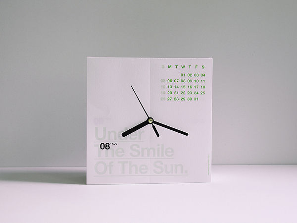
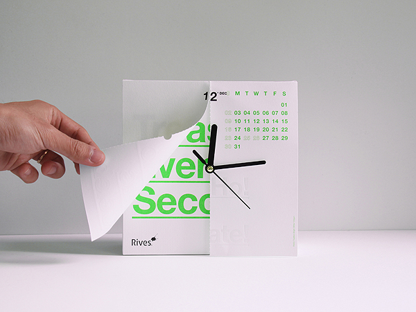
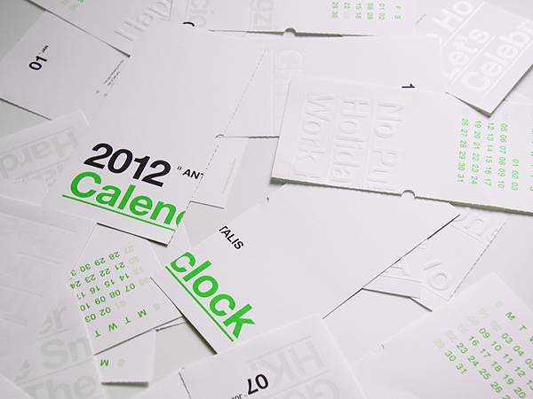
Antalis Calenclock 2012 by Ken Lo
Ken Lo is a designer for Hong Kong. He currently runs and manages his BLOW design studio, which was founded in 2010. Blow specializes in branding, identities, packaging, environmental graphics, print, publications and website design. Their recent innovative invention is the Antalis Calenclock 2012. The simple yet bold approach really stands out in the crowd.
This brilliant calendar idea, is presented in a very clever way. While showcasing time, you are able to see the month ahead, main holidays, and inspiration letter-pressed quotes to keep you motivated. By thinking about the relationship of date and time, 12 months and 12 hours on the clock, Ken Lo has designed a new format: Calenclock. Without further ado, we hope you will enjoy this design. There is currently no word on when it will be released. So far according to feedback, people would gladly make the purchase if the price is right.
Note: All Rights Reserved by Ken Lo
---------------------
This brilliant calendar idea, is presented in a very clever way. While showcasing time, you are able to see the month ahead, main holidays, and inspiration letter-pressed quotes to keep you motivated. By thinking about the relationship of date and time, 12 months and 12 hours on the clock, Ken Lo has designed a new format: Calenclock. Without further ado, we hope you will enjoy this design. There is currently no word on when it will be released. So far according to feedback, people would gladly make the purchase if the price is right.
Note: All Rights Reserved by Ken Lo
Antalis Calenclock 2012 by Ken Lo
Ken Lo is a designer for Hong Kong. He currently runs and manages his BLOW design studio, which was founded in 2010. Blow specializes in branding, identities, packaging, environmental graphics, print, publications and website design. Their recent innovative invention is the Antalis Calenclock 2012. The simple yet bold approach really stands out in the crowd.
This brilliant calendar idea, is presented in a very clever way. While showcasing time, you are able to see the month ahead, main holidays, and inspiration letter-pressed quotes to keep you motivated. By thinking about the relationship of date and time, 12 months and 12 hours on the clock, Ken Lo has designed a new format: Calenclock. Without further ado, we hope you will enjoy this design. There is currently no word on when it will be released. So far according to feedback, people would gladly make the purchase if the price is right.
Note: All Rights Reserved by Ken Lo
Did you like this design? If you have any feedback, please be sure to comment below! For more inspirational articles don’t forget to subscribe to the RSS-feed and follow Inspirationfeed on Twitter + Facebook! If you enjoyed the following article we humbly ask you to comment, and help us spread the word!
http://thegrid.soup.io/tag/emboss
Tags: Packaging 2012 Antalis Calenclock calendar Clock emboss Graphic Design Hot Stamping modern Print Design Product Design simple UV White
Another ANTALIS
http://www.antalissg.com/concept.html
---------
Antalis Review winners 2013


Radford Wallis also won two awards last night: its report for charity Farm Africa was named the best use of recycled paper and the best annual/interim report.


Another ANTALIS
http://www.antalissg.com/concept.html
---------
Antalis Review winners 2013

Bromley design studio Valle Walkley was named the overall winner at paper company Antalis's 23rd annual print design awards for its series of books documenting talks at London dance house Sadler's Wells.
The project (above) was selected out of 500 entries by judges Bob Mytton of Mytton Williams, Magpie's Ben Christie, Craig Oldham of Music and Checkland Kindleysides design principal Carl Murch for its “outstanding production and typography” and “creative use of colour”.
The project (above) was selected out of 500 entries by judges Bob Mytton of Mytton Williams, Magpie's Ben Christie, Craig Oldham of Music and Checkland Kindleysides design principal Carl Murch for its “outstanding production and typography” and “creative use of colour”.

The set of seven books, which use Freight serif and micro fonts, document a series of talks on the body and movement held at Sadler's Wells in 2008 as part of its annual body:language series, and were released to coincide with new lectures on the subject held in 2012.
“Sadler's Wells wanted a way to bring the 2008 talks up to date, so we tried to create something contemporary, adding additional annotations and footnotes but leaving plenty of space so people could take them along to the new discussions and make notes,” says Valle Walkley co-founder Daniella Valle.
“Sadler's Wells wanted a way to bring the 2008 talks up to date, so we tried to create something contemporary, adding additional annotations and footnotes but leaving plenty of space so people could take them along to the new discussions and make notes,” says Valle Walkley co-founder Daniella Valle.
“We've worked with other theatres, artists and exhibitions, and we always try to take a different approach to brochures or programmes,” she adds.

Body: language was also named the best book, beating Martin Usborne's design forI've Lived in East London for 85 ½ Years and Teresa Eng's for photography bookSpeaking of Scars.
The Designers Republic's book A Bunch of Fives (above), featuring responses to the question "What does five mean to you?", won an award for the best use of Antalis's creative paper stock, a new category introduced this year.


Radford Wallis also won two awards last night: its report for charity Farm Africa was named the best use of recycled paper and the best annual/interim report.
Geordie Dave's mailer Howay in a Manger topped the direct mail category (above), while AV Brown's Nocturnal won best in stationery for its “fun use of glow in the dark ink and textured stock”.
Alphabetical's College to Industry A-Z, a directory of design agencies produced for D&AD's New Blood festival, won the brochure – services award. The project was described by judges as “an effortless piece” and “a strong idea” (below).


Made Thought won two brochure awards – its catalogue for furniture collection Made in Ratio was voted the best product brochure for its combination of good design and interesting photography, and its Design Miami 2012 programme was named the best corporate brochure, with judges describing the product as “perfect for its audience” and “engaging all the way through” (both below).


Five Foot Six was named the best example of magazine design for its striking work on 56+1 issue, What Next? - a collaboration with creative agency and gallery Beach London - while Magpie's advert for National Prison Radio won the digital print category.


It was a strong selection of work and an impressive shortlist, too: highly commended projects included WPA's direct mail campaign for charity event Art is Rubbish, NB Studio's This Year mailout on the subject of the Mars Rover; MWM Creative's InformForm (shortlisted for best magazine) and OK-RM's direct mail campaign for the Strelka Institute.

Pink Floyd fans may recognise the cover of our June issue. It's the original marked-up artwork for Dark Side of the Moon: one of a number of treasures from the archive of design studio Hipgnosis featured in the issue, along with an interview with Aubrey Powell, co-founder of Hipgnosis with the late, great Storm Thorgerson. Elsewhere in the issue we take a first look at The Purple Book: Symbolism and Sensuality in Contemporary Illustration, hear from the curators of a fascinating new V&A show conceived as a 'walk-in book' plus we have all the regular debate and analysis on the world of visual communications.
You can buy Creative Review direct from us here. Better yet, subscribe, save money and have CR delivered direct to your door every month.
CR for the iPad
Read in-depth features and analysis plus exclusive iPad-only content in the Creative Review iPad App. Longer, more in-depth features than we run on the blog, portfolios of great, full-screen images and hi-res video. If the blog is about news, comment and debate, the iPad is about inspiration, viewing and reading. As well as providing exclusive, iPad-only content, the app updates with new content throughout each month. Get it here.
http://www.creativereview.co.uk/cr-blog/2013/june/antalis-review-winners-2013
---------------------
Huge handmade cutout project for the paper merchant Antalis in colaboration with Amanda-Li Kollberg.
Jan. 2014
http://cargocollective.com/thisissiri/Antalis-paper-wall
-------------------------------
The Antalis Hong Kong memo calendar 2014
by EVA HOEVENAAR on 29 JANUARY 2014
Every year, Antalis Hong Kong collaborates with local designers to create their promotional calendar. This year they worked with Hong Kong-based office Milk Design. The result of this collaboration is the charming Antalis memo calendar 2014.
On top of creating a functional calendar, Milk Design set out to use Antalis paper as a means to allow users to plan their schedule more conveniently. In doing so they hope to have designed an object that will grace desktops well after 2014 has ended. Their paper choice doesn’t hurt; there is one eco version using waste paper collected from Antalis and four colour versions using fine coloured paper from Skin curious collection®. Skin is a range of papers from Arjowiggins Creative Papers that offer amazingly even matt colours that are silky smooth to the touch. The vibrant, contemporary colours will set off any design.
The set comes with a memo pad set especially designed for inserting into the paper block. Dates are marked on top of the paper block, to be cross-checked with the rotatable monthly calendar printed at the front. The idea is to plan your schedule by just inserting all your daily memos, business cards, tickets, receipts or important notes into the paper block according to the date markings.
In a time when even the most hardcore paper lovers among us tend to look towards digital solutions for our functional planning needs it is nice to see Milk Designs attempt to use paper to create a truly convenient multifunctional object. The rest of 2014 will show whether their system of rotating cards and inserting receipts works as such, but they will definitely have succeeded at producing a lovely, tactile object to counterbalance our digital lives.
For more info about the calendar see: www.milkdesign.com
For more information about SKIN curious collection® see: www.antalis.nl
For more information about SKIN curious collection® see: www.antalis.nl
Source : http://monsterkamer.com/2014/01/29/the-antalis-hong-kong-memo-calendar-2014/
--------------------------
http://stickandvessel.tumblr.com/page/9
--------------------------
--------------------------
http://stickandvessel.tumblr.com/page/9
--------------------------
SOCK DESIGN COMP
SOCK DESIGN COMP - great entries
 these are some of the designs i partcularly wanted to highlight as some of my faves. although sock it to me might not have thought them right for socks this time they are still really great patterns. as all the judging took place anonymously with no names attached to the files i dont have any info on whose designs these are so if you recognise yours and would like a credit do let me know. all the other finalists can be see in a gallery online here. above : flower design by maira chiodi.
 above : pears apples and oranges by muffin grayson

 above : swirley flowers by nicole riseley of silver acorn designs

 above : neat feet by heather dutton
above : birds and hearts by vicki gausden
http://printpattern.blogspot.com/2010/03/sock-design-comp-great-entries.html
Subscribe to:
Posts (Atom)


